
Your search shows up in two places: the dropdown that opens under your search box, and an optional full results page. This article covers how much each one shows, how the results page loads more products, and which filters shoppers can use to narrow things down.
Open Live on your store → Search, open a configuration and go to Configure → Results & Filters. The live preview next to the editor updates as you change things.
Choose what the dropdown shows
Under What the dropdown shows, pick one of three options:
- Suggestions only: a short list of matching products. Shoppers pick one straight from the dropdown. Set how many with Suggestions shown (1 to 12).
- Results: the full product grid, loading more as shoppers scroll.
- Results and filters: the grid plus a filter sidebar. On narrow screens the sidebar folds into a Filters button.
If you have a results page, pressing Enter or clicking "View all results" always opens it. Without a results page, the dropdown is the whole search experience, so Results and filters is usually the best pick.
Which one suits you? Suggestions only keeps the dropdown compact and works well for small catalogs or stores where shoppers know what they want. Results and filters works well for large catalogs where shoppers browse and compare.
Choose how the results page loads more
Under How the results page loads more, choose Load more as they scroll or Numbered pages. This only affects the results page. The dropdown always loads more as shoppers scroll.
If you see "No results page set up yet.", click Set one up. It takes you to the Launch step. How a results page is added depends on your platform, see Launch search on your store.
Pick your filters
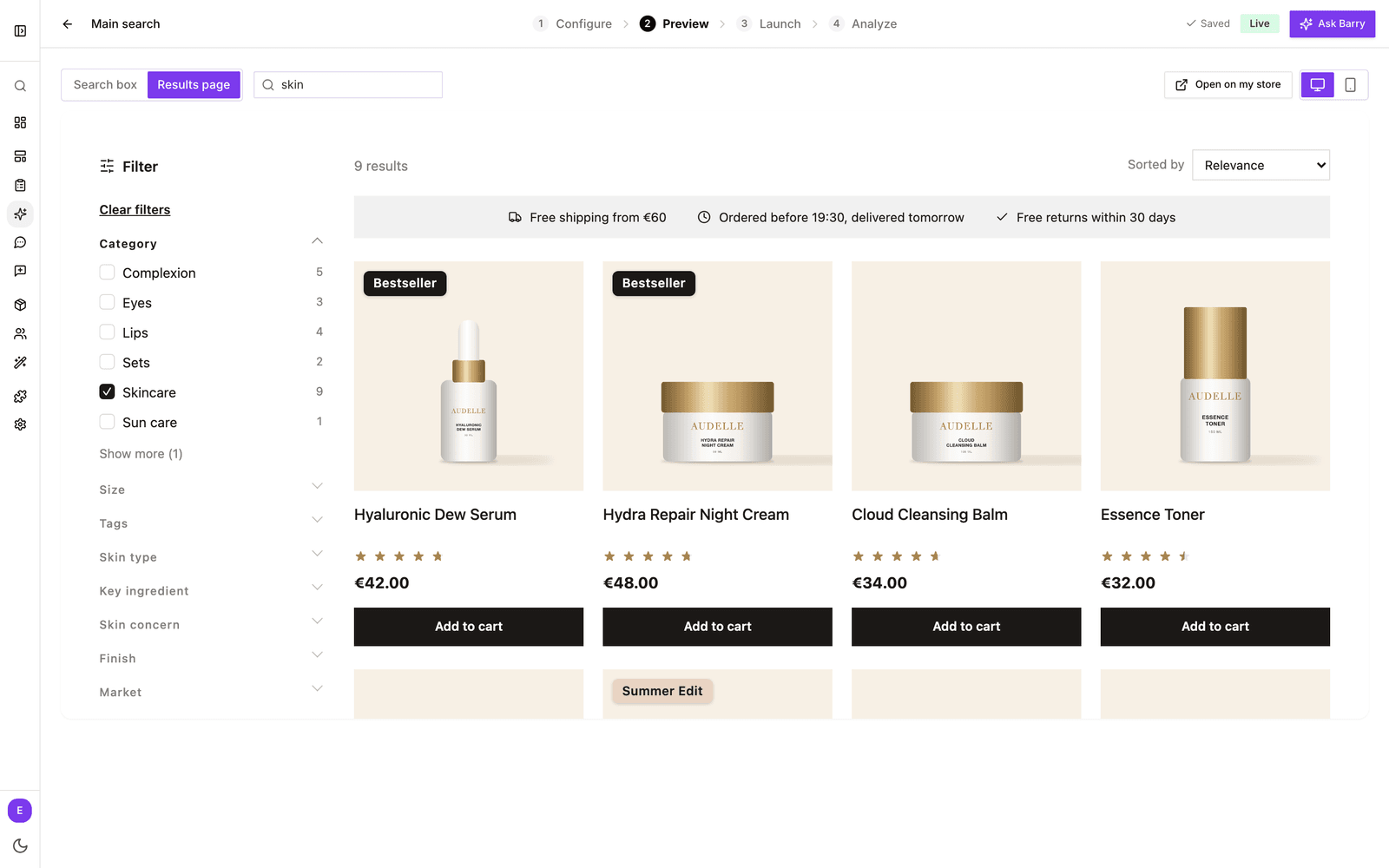
Filters let shoppers narrow a search like "dress" down to their size, color or brand. They show in the sidebar on the results page, and in the dropdown when it shows results and filters.
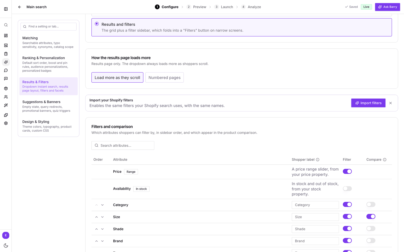
- Go to Filters and comparison.
- Turn on Filter for each attribute shoppers should be able to filter by.
- Use the arrows in the Order column to set the order of the filters in the sidebar. Put the ones people use most, like size or category, at the top.
- Optionally give a filter a friendlier name under Shopper label, such as "Size" instead of "size_eu". Leave it empty to use the property name.
Not sure where to start? Above the table, Recommended lists attributes that make good filters, with how many of your products have a value and how many different values there are. Click one to add it.
On Shopify you also see Import your Shopify filters. Click Import filters to turn on the same filters your Shopify search uses, with the same names. If bluebarry cannot read your Shopify filter setup, it turns on recommended filters instead and tells you which ones.
On Magento, Import filters turns on the attributes your layered navigation filters by, in the same order and with their names in the default store view. A price filter turns on the price range. The module reports these filters once a day and when you save its settings, from version 2.1.0. Until it has, bluebarry turns on recommended filters instead and tells you which ones.
A filter added by a search starting point, an import or Barry never shows a raw property name. When your store has no name for it, it gets a readable Shopper label, such as "Climate" instead of "attr_climate". An import also names a filter that was already on without a label. Ask Barry to rename a filter, for example into your store's language, and it changes the Shopper label for you.
Price and availability filters
Two filters are built in, so you do not need a special attribute for them:
- Price: a price range slider. It uses the price property you pick under Design & Styling.
- Availability: in stock and out of stock. It uses the stock property you pick under Design & Styling.
If either one says it needs a property, set the price or stock property first, see Style your search.
Let shoppers compare products
In the same table, turn on Compare for the attributes that matter when choosing between products, such as capacity, material or weight. As soon as one attribute has Compare on, result cards get a compare checkbox. Shoppers tick two or more products and open a side by side view of exactly those attributes.
The Shopper label is used here too, so a clear name pays off twice.
Good to know
- Changes save automatically. Check them in the Preview step, where you can switch between Search box and Results page and between Desktop and Mobile.
- Filter values come from your product data. If a filter looks messy, with values like "Red" and "red", clean them up in your catalog, see Manage product properties.
- Which attributes are searched is a separate setting under Matching, see Tune search matching. An attribute can be a filter without being searched.