
Search should feel like part of your store, not a plugin. Match your colors and font, decide what each result card shows, and add badges that point shoppers to deals and new arrivals.
Open Live on your store → Search, open a configuration and go to Configure → Design & Styling. The live search widget sits next to the editor, so you see every change straight away.
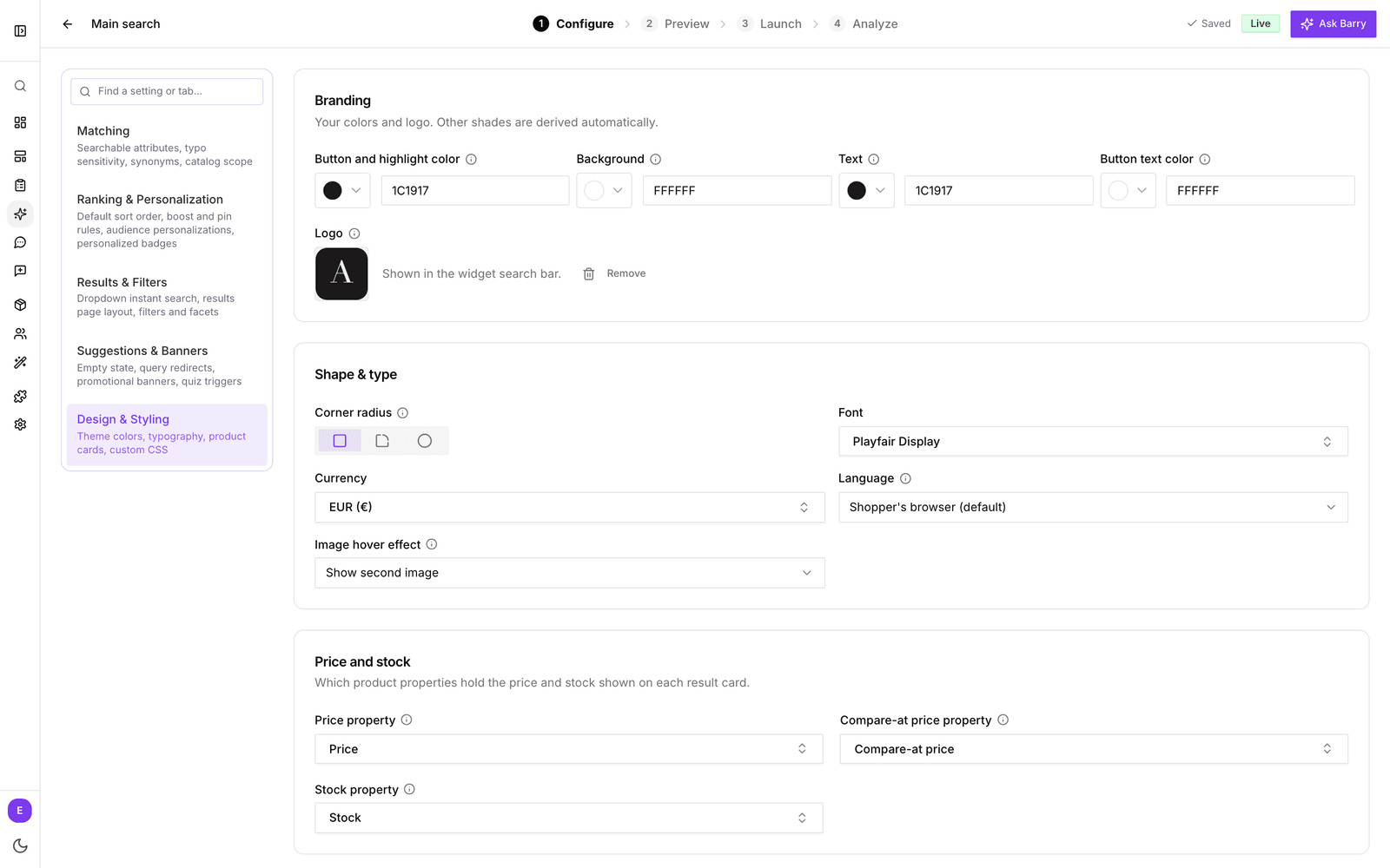
Branding
Set four colors and bluebarry derives the other shades for you:
- Button and highlight color: buttons, active states and highlights. Usually your brand color.
- Background: the search panel background.
- Text: primary text and icons.
- Button text color: text on buttons and other elements in your highlight color. Pick one that is easy to read on it.
Add a Logo (PNG or SVG) to show it in the search bar. It is optional.
Shape and type
- Corner radius: Sharp, Rounded or Extra rounded, for product images and labels. Match the look of your theme's buttons and cards.
- Font: search the Google Fonts catalog or the common system fonts for the one your store uses, or leave it on System default.
- Currency: the currency prices are shown in. When your store has markets, search shows each market's own currency and this setting is hidden.
- Language: the language of the widget's own text, such as the placeholder, buttons and filter headers. Choose Dutch, English, German, French, Spanish, Italian, Swedish, Romanian or Polish, or leave it on Shopper's browser (default) to show each shopper their browser language, with English as the fallback. When your store has markets, the widget speaks the language of the page instead and this setting is hidden. Product names and descriptions stay as they are in your catalog.
- Image hover effect: what happens when a shopper hovers over a product image. None, Show second image, Cycle through images or Zoom in. This is desktop only. Phones show the first image.
The result card
Each product in search is shown as a card. These settings decide what is on it. Most of them point to a product property, so you choose which field in your catalog holds the price, the stock or the rating.
Price and stock
- Price property: the price shown on the card. None hides prices.
- Compare-at price property: the price before discount, shown struck through when it differs from the price.
- Stock property: the stock quantity. At 0 or less a product shows as sold out.
The price and stock properties also power the price and availability filters, see Configure search results and filters.
Price display and VAT
Selling to businesses, or in a market where prices without VAT are common? Under Show on cards, choose Incl. VAT only, Incl. and excl. VAT or Excl. VAT only. As soon as you show prices excluding VAT, pick an Excl. VAT property that holds that price, or enter one VAT rate for the whole catalog. Currency sign turns the € or other sign on or off for every price in search.
Images, reviews and variants
- Additional images: a property with extra image URLs per product. The image hover effects use these.
- Reviews: pick a Rating property and a Review count property to show star ratings on each card.
- Variants: turn on Show variants to show color or style swatches on each card.
Quick add to cart
Turn on Quick add button to put an "Add to cart" button on each card, so shoppers can buy without leaving search. Products with a choice to make, such as a size, open the product page instead. On Shopify, WooCommerce, CCV Shop and Magento, quick add puts the product in your store's own cart.
Card properties
Show product details on each card, such as the brand above the title, the size or material below it, or the delivery time below the price. Card properties belong to a storefront profile, so they show on search results and on collection pages that use it. Open Store data → Storefront profiles, open a profile and go to Product cards. Under Card properties, pick a property from Add a property to the card. Any property works: text, numbers, lists and yes/no properties. Then choose:
- Position: Above title, Below title or Below price.
- Style: Text shows the value, Label: value puts the label in front of it, and Pills puts each value in its own pill, which suits lists like sizes.
- Label: the name shoppers see. A yes/no property shows its label on the products where it is yes, so a "Vegan" property reads "Vegan" on vegan products and nothing on the rest.
- Format: text around the value, with
{value}where the value goes, so{value} mlshows "500 ml". - Text color and, for pills, Pill color. Reset goes back to the widget's own colors.
Use the arrows to change the order. Each property takes one line, and a product without a value keeps an empty line, so prices and buttons stay level across a row. Labels and formats are translated with the rest of your search texts. Developers can style one property on its own with custom CSS: each carries its property name, as in .sb-product-prop[data-property="brand"].
Badges
Badges are small labels in the top-left corner of a result card. Click Add badge and choose a Type:
- Sale: shows on discounted products. Set a Minimum discount % to only show it for real deals (0 shows it for any sale). Write the label with
{discount}to show the percentage, so-{discount}%becomes "-20%". - Tag: shows on products with the tags you pick, such as "New" or "Bestseller".
- Sold out: shows on products whose stock is 0 or less. Products without a stock value count as in stock.
Pick a Background color and Text color and check the Live preview. Want badges that depend on who is shopping, like "For dry skin"? That is a personalized badge, see Personalize search results.
Custom CSS
The settings above cover most stores. If you or your developer want to go further, there are two CSS fields: Search box CSS for the dropdown and Results page CSS for the results page. Your CSS loads after ours, so plain rules win without !important.
Search runs in its own isolated layer on your page, so your theme's CSS cannot break it by accident, and CSS in these fields is the way to style it. bluebarry keeps a set of stable class names, all starting with sb-, that developers can target safely across updates. Classes containing sb-i- are internal and can change without notice, so leave those alone.
Good to know
- Changes save automatically. Use the Preview step to check the result on desktop and mobile, or open it on your own store without shoppers seeing it, see Set up search.
- If a card shows no price or no stars, check that the property you picked is filled for your products under Store data → Products.