The result page is where a quiz earns its keep. Everything before it, the questions, the matching, the design, exists to set up this one screen: the moment personal advice either turns into a cart or into a closed tab.
Across live finders, completion rates average 89%, so most shoppers do reach the result page. Whether they convert there is a design question, and it is the most under-designed screen in ecommerce. This article covers what a quiz result page is for, the anatomy that works, and the mistakes that quietly cap your conversion. It is part of the complete guide to product recommendation quizzes and finders.
The job of a result page
A result page has exactly one job: convert the trust the shopper just gave you into a confident next step. The shopper answered five to eight personal questions. That is an investment, and the result page pays it back or squanders it. Pay it back and quiz takers out-convert regular visitors by triple digits, like Ergo2Work's 126%. Squander it, with a generic grid and no explanation, and the quiz was an expensive way to show a category page.
The anatomy of a result page that converts
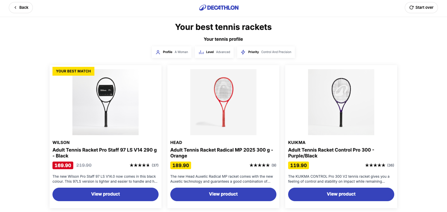
- A headline that echoes their answers. Not "your results" but "the best tents for your rainy family trip". The echo proves the advice is theirs, not everyone's.
- One top match, plus two or three alternatives. A hero recommendation gives the decisive shopper a default; the alternatives give the cautious shopper a sense of control. Twelve products is not advice, it is a new wall.
- A "why this fits" explanation per product. One or two lines connecting the recommendation back to their answers. This is the salesperson's "because you said ...", and it is what separates advice from an algorithm dump.
- Price, availability and reviews in view. The shopper should not have to leave the result page to judge the recommendation, because every extra hop loses people.
- A save-your-results email option. Considered purchases rarely close in one session; email delivery makes the result durable and starts the follow-up flow. More on the mechanics in the lead generation quiz guide.
Pick one primary CTA
Decide what this page optimizes for before you design it. Immediate add-to-cart? Email capture? Starting a bundle? A demo or store visit for high-ticket products? All are valid, but a result page that asks for everything converts to nothing. Pick one primary action, style it as the obvious next step, and demote everything else to secondary links. For a €30 skincare product the answer is usually add-to-cart; for a €2,000 e-bike it is often "book a test ride", and forcing a cart CTA there just measures the wrong thing.
Where the email step goes
The email field can sit before the results (maximum list growth, some completion cost) or on the result page as an optional save (maximum trust, smaller list). The honest default: show the results, offer email delivery as a service. Shoppers leave an address when the result is worth keeping, and an address given willingly outperforms one taken as a toll. Test the gate only when list growth is explicitly the quiz's primary goal.
The mistakes that cap conversion
- Too many recommendations. The quiz promised to narrow; the page re-widens.
- No explanation. Products without a "because you said" read as random, and random breaks trust instantly.
- Dead ends. An answer combination with zero matches should never reach the shopper. Attribute-based matching prevents this by design; hand-picked product matching invites it. The matching section of the guide explains why.
- Ending the data's life on this page. The answers behind the result should flow to the shopper's email profile and the rest of the site, not evaporate on tab close.
Measuring the result page
Two numbers tell you if the page works: conversion of completed sessions (live stores on bluebarry range 4 to 29%, placement and price point decide where you should sit) and revenue per session (€11 median across our benchmark set). A quiz that completes at 90% but converts at 2% has a result page problem, not a quiz problem. Reference points for both are in the product quiz benchmark report.
Design less, generate more
Describe your store and AI drafts the quiz and the result page from your own catalog, explanations included. Free for 14 days.